Digital RGB vs Printed CMYK
Simply put, RGB and CMYK are different languages of colour.
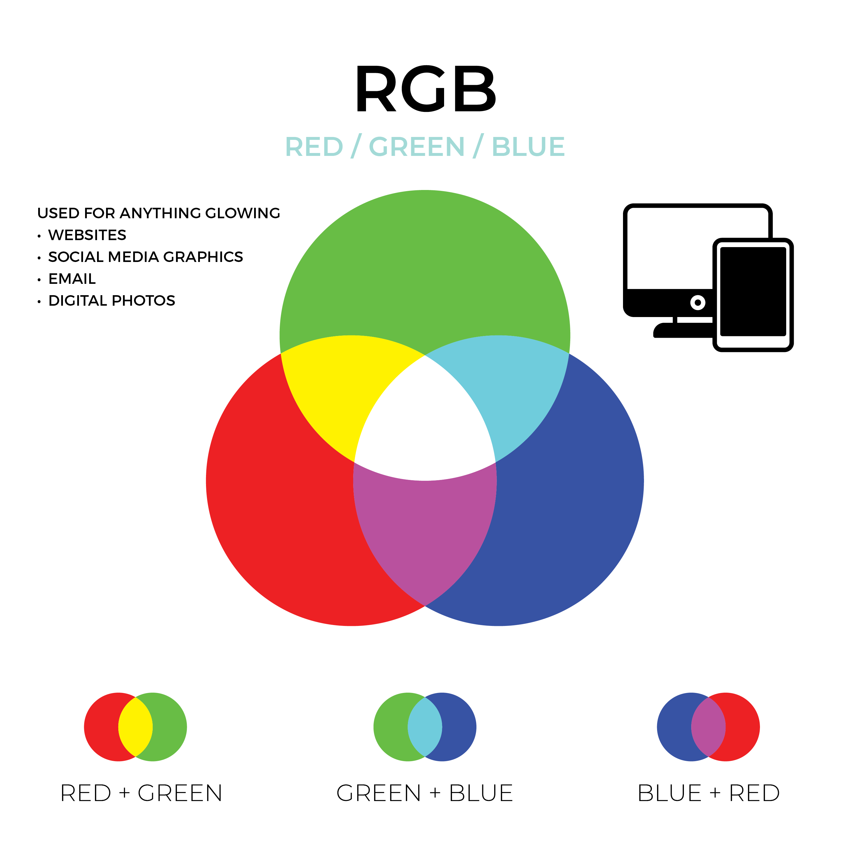
Digital RGB + HEX Codes
On a screen, RGB adds light to make colours. Every pixel on your phone or laptop is a tiny combo of R, G, B lights blending into 16+ million hues (with 255 levels each).
Our customers quite often give us HEX codes to work with. There is no informational difference between RGB and HEX colours; they are simply different ways of communicating the same thing, a red, green, and blue colour value used for digital only. We will always need to convert HEX
colours to a similar CMYK colour for printing.
Printed CMYK
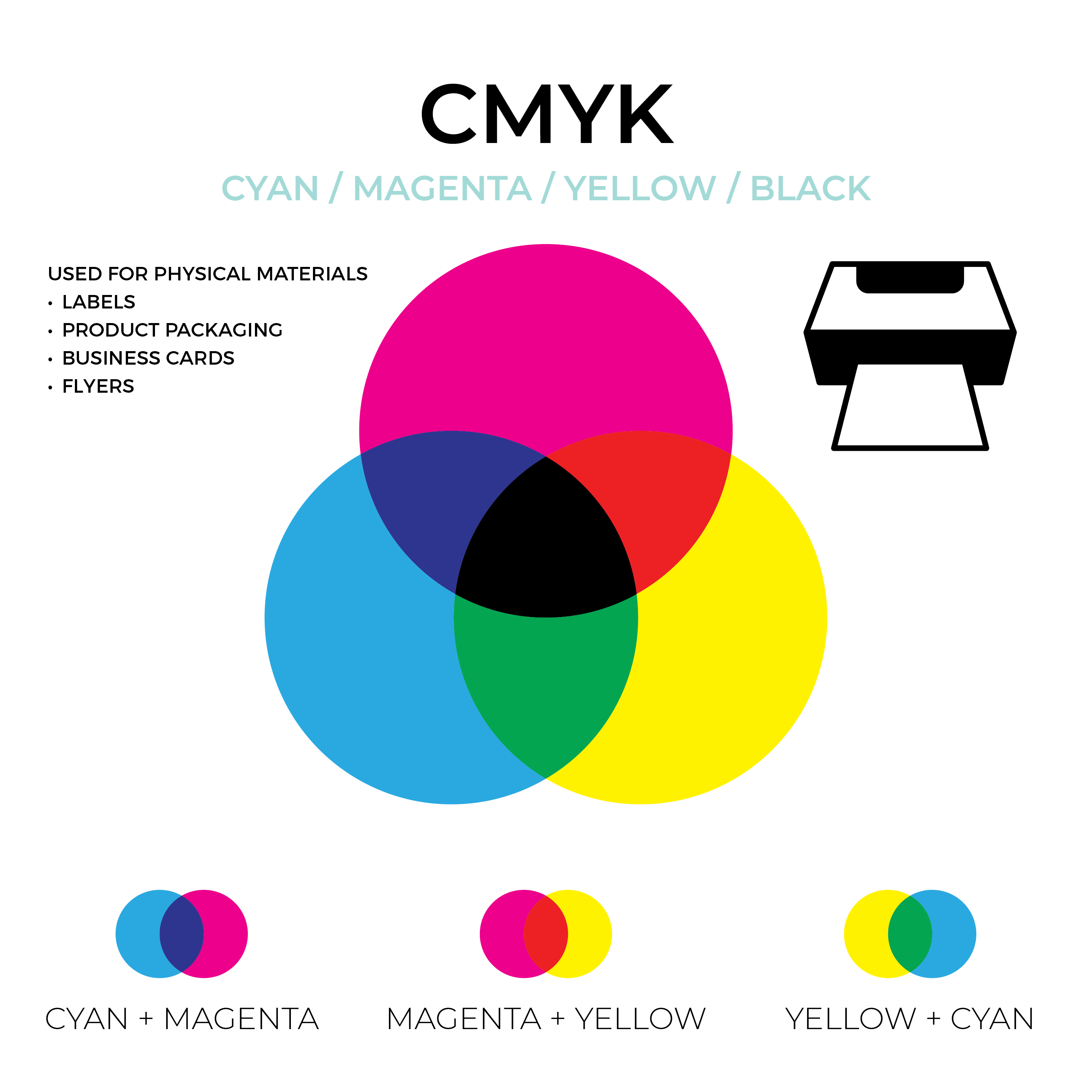
CMYK is the colour model for colour printing, and the method we use for our digitally-printed packaging.
CMYK inks absorb or subtract light from white paper to create colours, with black (“Key”) for depth.
So why do colours matter for expectations?
The on-screen designs that you're seeing (and often approving) use RGB on-screen colours, which have a broader, more vibrant colour range, including neon-like brights you simply can’t replicate with ink. So colours that pop on your monitor may look flatter or more muted in print.
Other factors that shift colour:
- The same printed packaging can look completely different under warm indoor lights vs cool daylight, or depending on your camera settings.
- A bright white, coated paper will keep colours punchy. A natural kraft stock? It’ll soak up ink and soften the effect.
In short, printed colours are real-world colours. So while small shifts are normal, knowing what causes them helps set better expectations.



Converting RGB to CMYK
Because most digital printers only use CMYK, any RGB artwork must be converted before printing. This happens in your design software (Adobe Photoshop and Illustrator etc.) or at the factory.
When you are using software, you can often choose a CMYK profile and the program will try to preserve the colours that both spaces share and gently changes any out-of-gamut RGB colours to the nearest CMYK equivalent.
After conversion, you’ll usually see changes: ultra-bright RGB colours (electric blues, vivid reds, neon greens) will appear duller. Sometimes the hard truth is that there is no physical way to represent many RGB colours in a printed version.
So, what are Pantone colours?
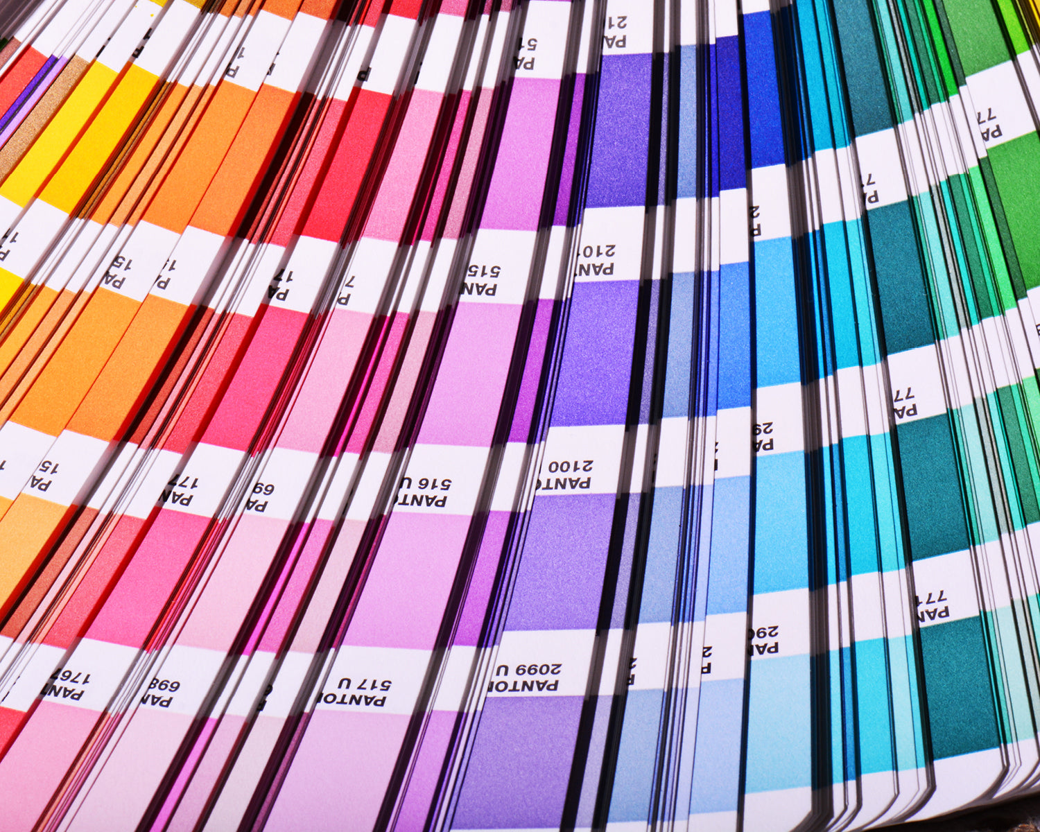
Pantone colours, also known as spot colours, are pre-mixed inks created using a standardised system called the Pantone Matching System (PMS). Unlike CMYK, which blends four inks during printing, Pantone uses precise formulas to produce consistent, exact shades every time.
Think of it like paint: instead of mixing colours, you’re asking the printer to use a ready-made, custom colour straight from the tin.
Why use Pantone instead of CMYK?
If your brand colour is crucial, say, the exact green on your logo or the red on your packaging, Pantone is your best bet. It removes the guesswork and variation that can happen with CMYK, especially across different printers or materials.
Pantone colours are particularly useful when:
- Colour consistency is essential across multiple print runs or products
- You're working with colours that CMYK struggles to reproduce (like vibrant oranges, pastels, or corporate blues)
- You need special finishes like metallics or fluorescents
It costs a bit more, but if colour accuracy is a deal-breaker, Pantone makes sure what your customer sees is what you intended, every time.
So, what are Pantone colours?
Pantone colours, also known as spot colours, are pre-mixed inks created using a standardised system called the Pantone Matching System (PMS). Unlike CMYK, which blends four inks during printing, Pantone uses precise formulas to produce consistent, exact shades every time.
Think of it like paint: instead of mixing colours, you’re asking the printer to use a ready-made, custom colour straight from the tin.

Why use Pantone instead of CMYK?
If your brand colour is crucial, say, the exact green on your logo or the red on your packaging, Pantone is your best bet. It removes the guesswork and variation that can happen with CMYK, especially across different printers or materials.
Pantone colours are particularly useful when:
- Colour consistency is essential across multiple print runs or products
- You're working with colours that CMYK struggles to reproduce (like vibrant oranges, pastels, or corporate blues)
- You need special finishes like metallics or fluorescents
It costs a bit more, but if colour accuracy is a deal-breaker, Pantone makes sure what your customer sees is what you intended, every time.
working smarter
Tips for the best print outcome
Getting an exact match between screen colours and printed packaging can be tricky, but there are ways to get as close as possible. Here’s how to stack the odds in your favour:
1. Design in CMYK (or convert early)
Start your design files in CMYK mode. It gives you a more accurate preview of how colours will look when printed, and helps avoid surprises later.
2. Avoid colours outside the CMYK range
Super-bright neons or deep saturated hues often fall outside CMYK’s limits. If you need a colour to be exact, consider using a Pantone (spot) colour - these are pre-mixed inks that guarantee consistency, especially for brand-critical colours.
3. Calibrate your monitor
A well-calibrated, properly lit screen gives you a better read on how your colours will translate. Avoid designing or reviewing files in dim light or on a phone with low brightness, it’ll skew your perception.
4. Ask for a proof
For peace of mind, request a printed proof before a full run. This gives you a real-world look at colour, material, and finish. (Fees apply ask us for details.)
5. Communicate your colour goals
If you have specific colours in mind, share Pantone numbers or even physical swatches. We can recommend the best paper stocks and processes to help hit the mark.
6. Manage expectations
Even with the best prep, a slight shift between digital design and final print is totally normal. With smart planning, though, you can keep those shifts small and your brand looking its best.
